QUAKER re-Brand
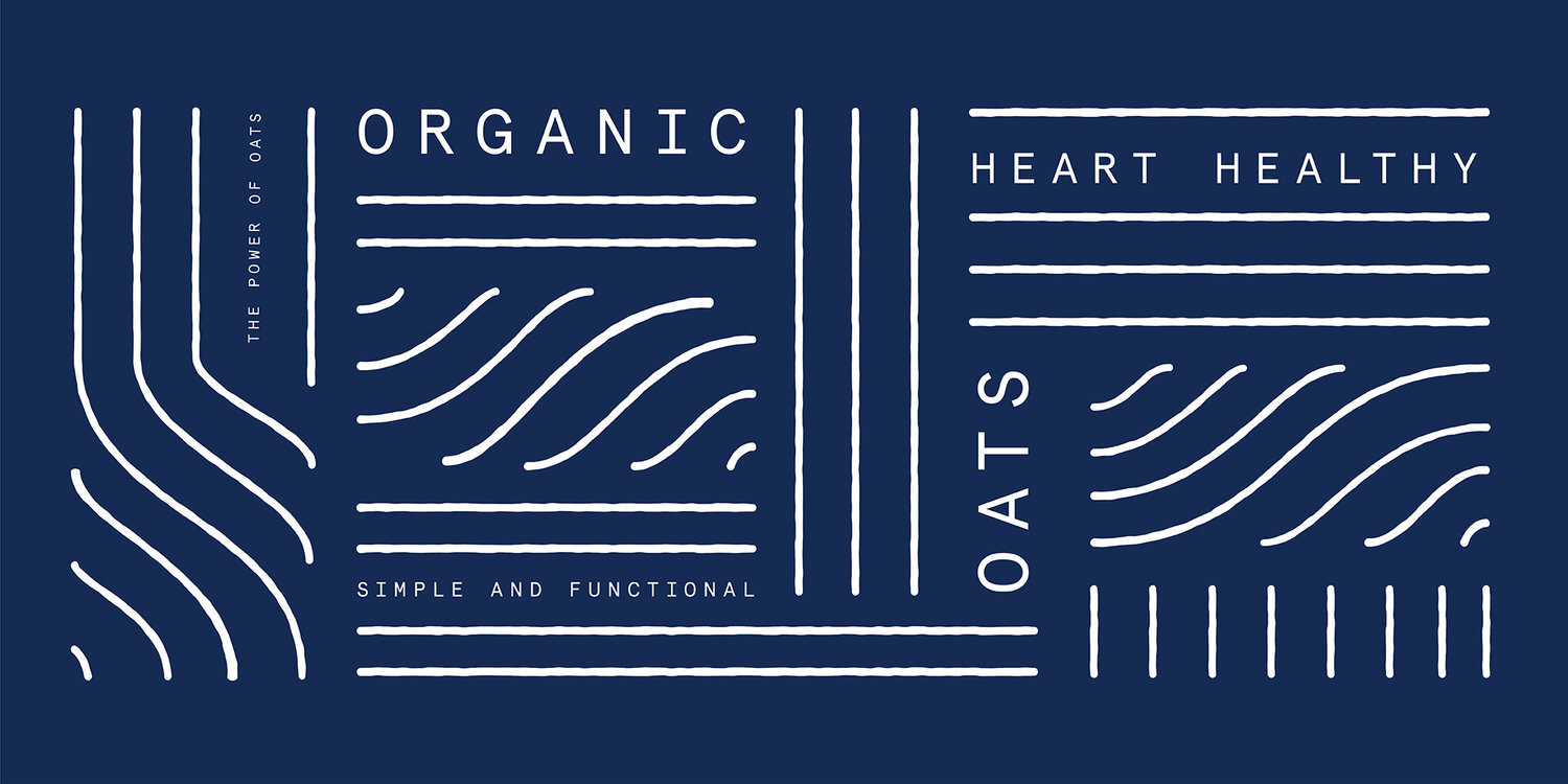
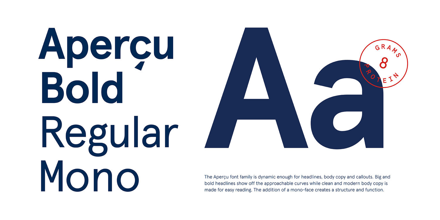
Quaker Oats can be found in more than half of the homes in America, so brand recognition wasn’t their problem. While nutritious oats should have been a natural fit for their lifestyles, Quaker was somehow not connecting with health-conscious people — particularly Boomers — who were leaving the brand for other healthy alternatives. Our creative idea was simple: a new visual and verbal system to shift Quaker from America’s oldest packaged cereal company into a modern health and wellness brand. We used functionality, simplicity, and empathy as filters when developing each element in the system to communicate Quaker’s timeless brand values.
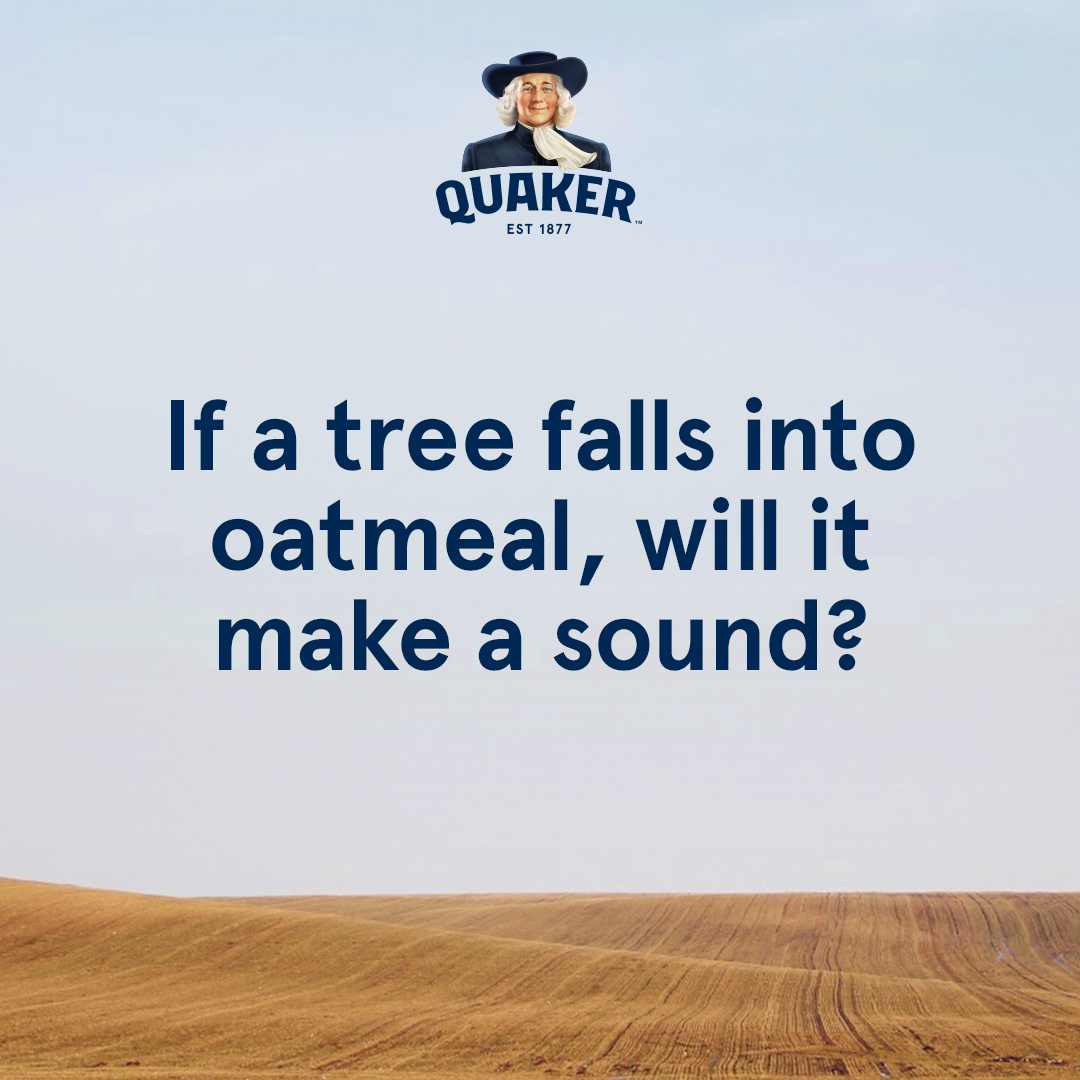
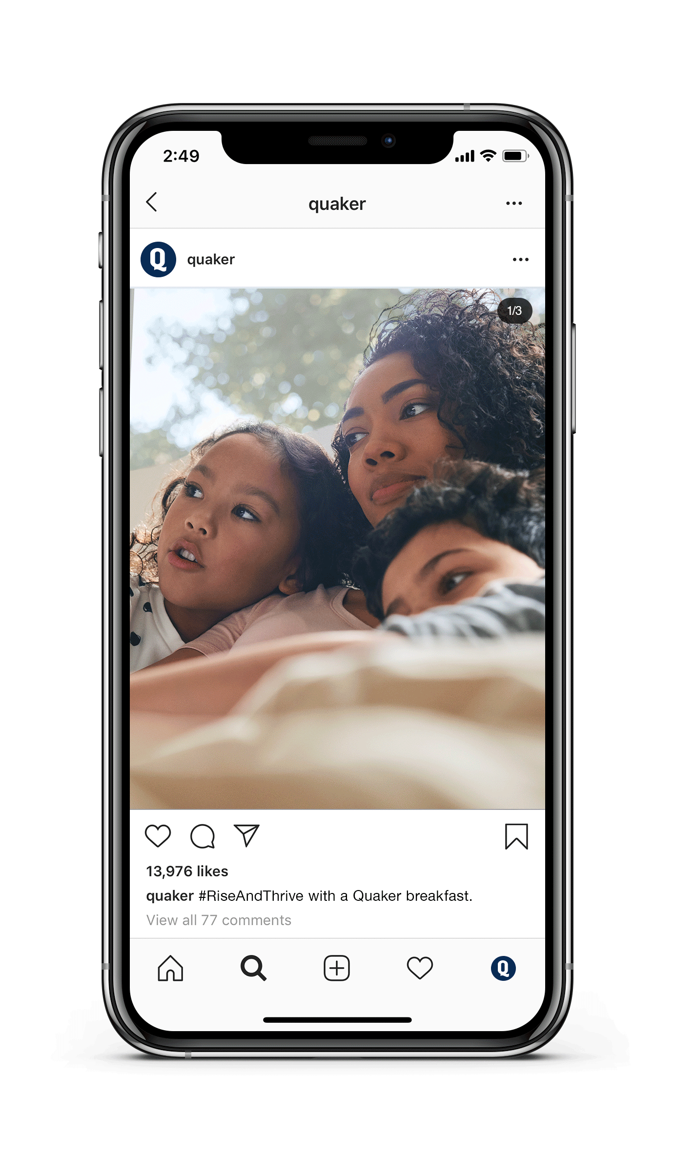
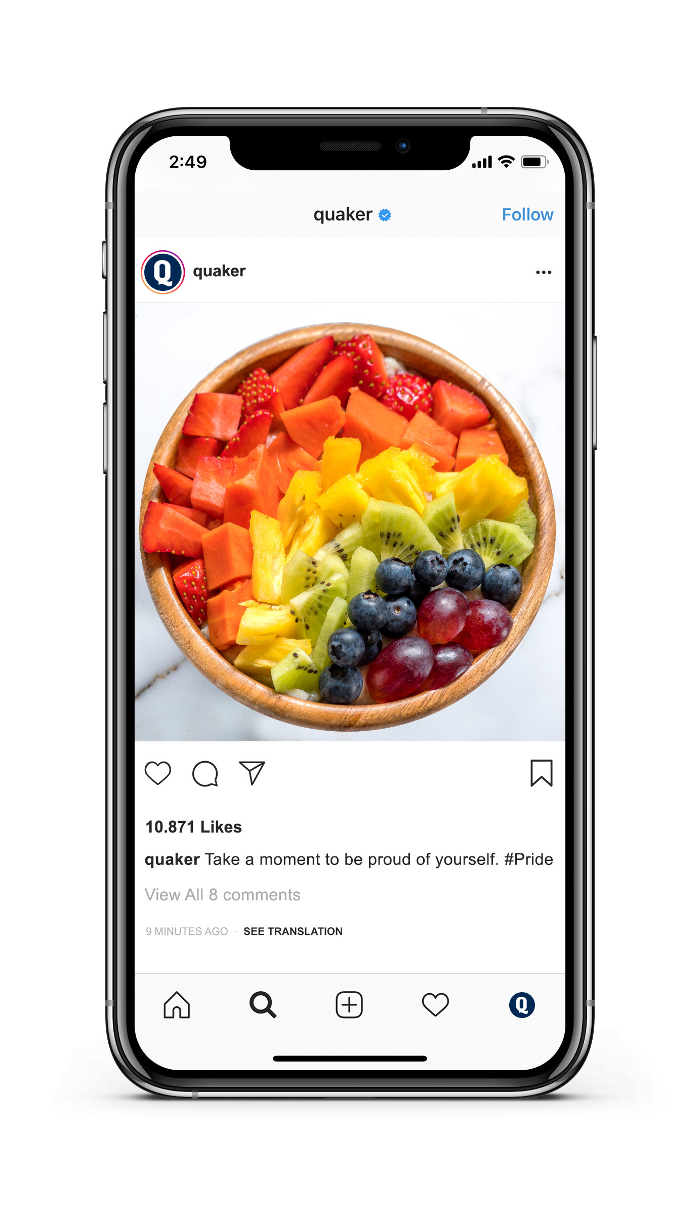
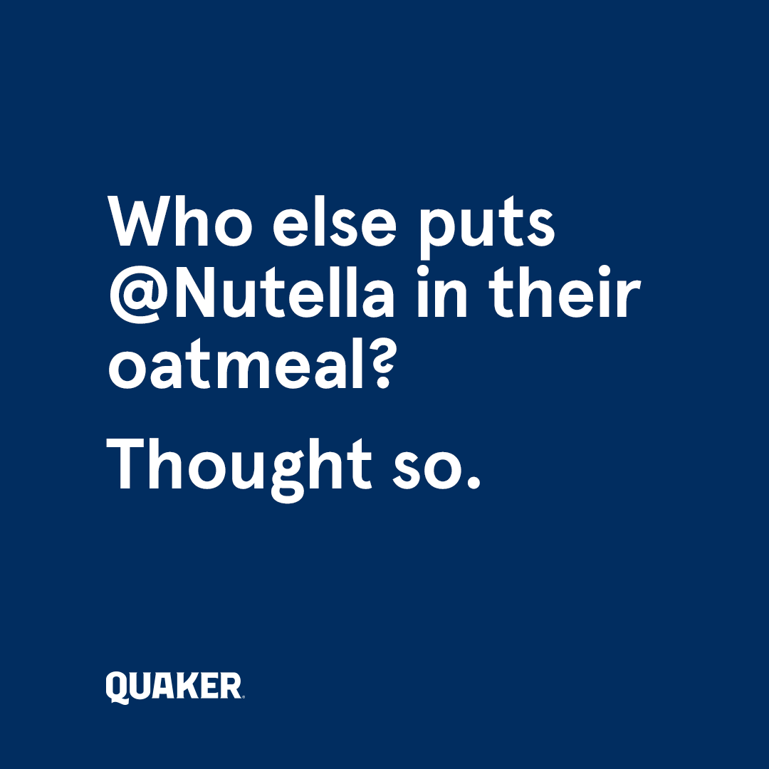
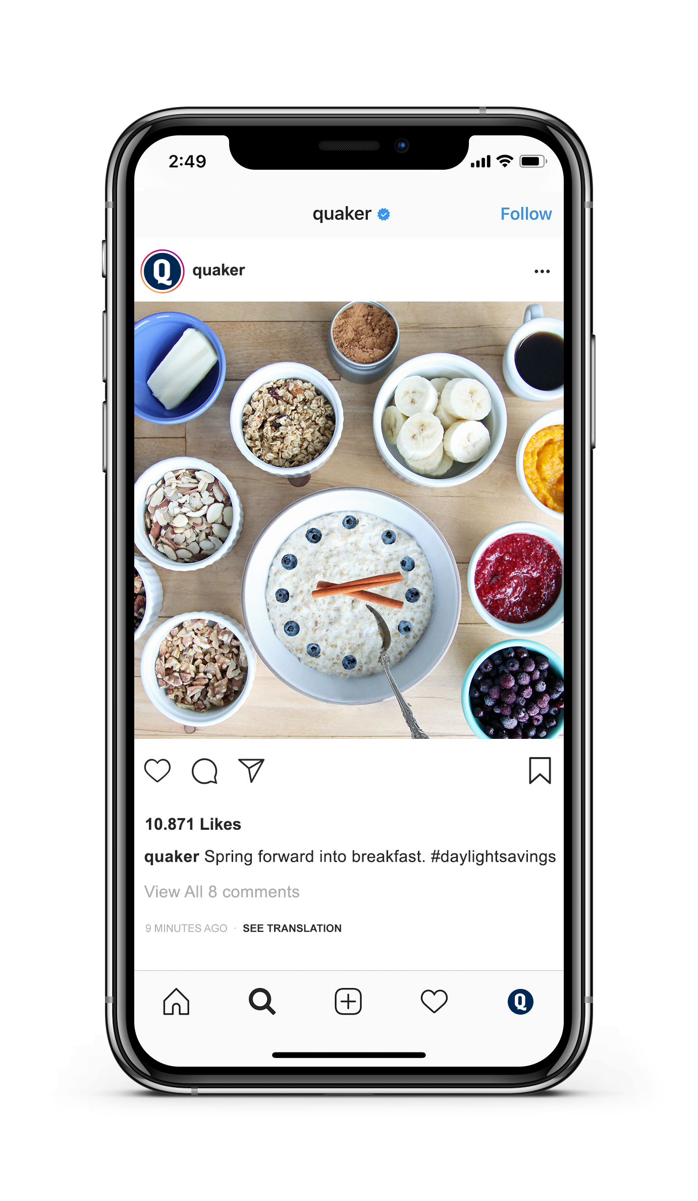
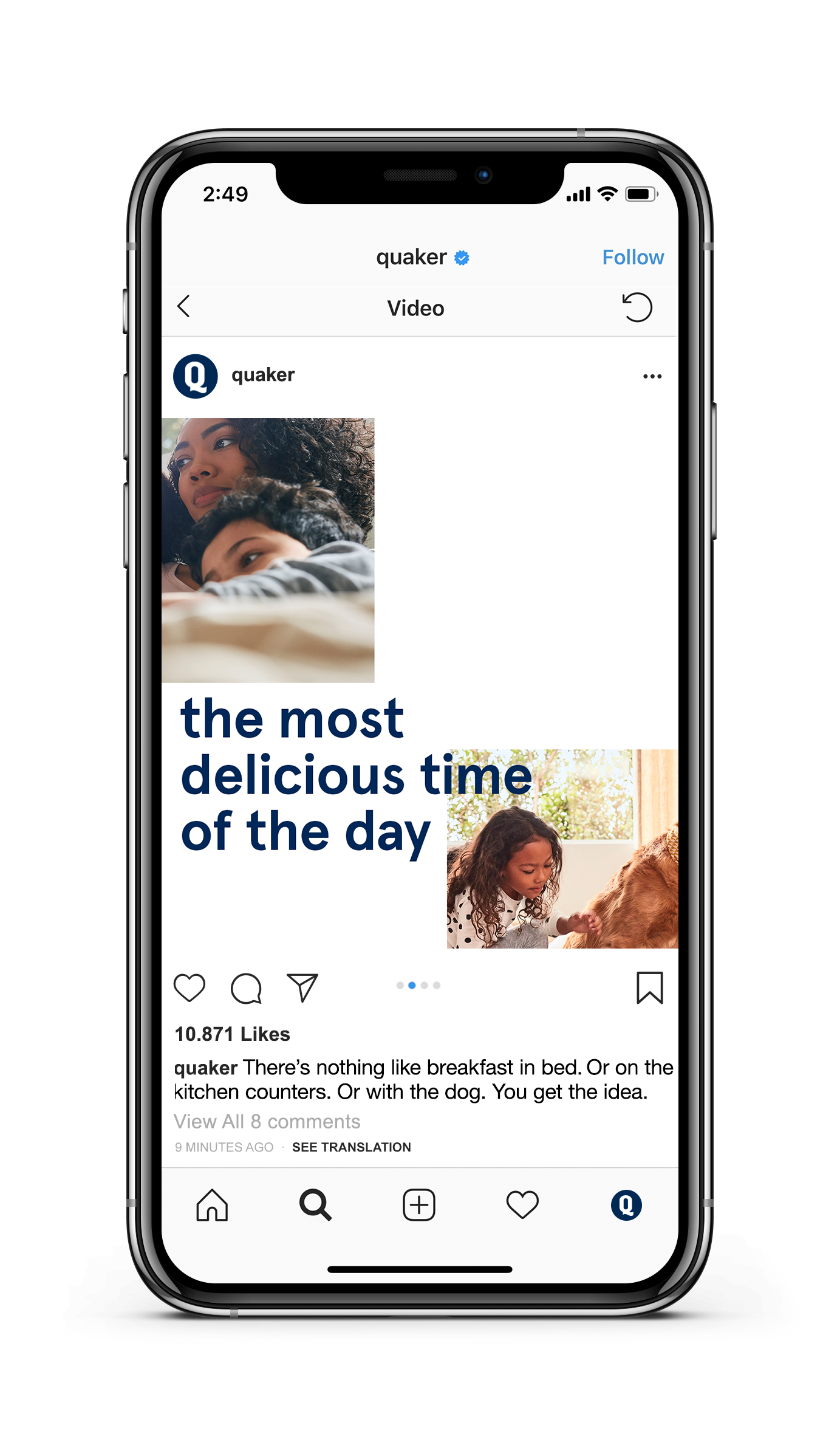
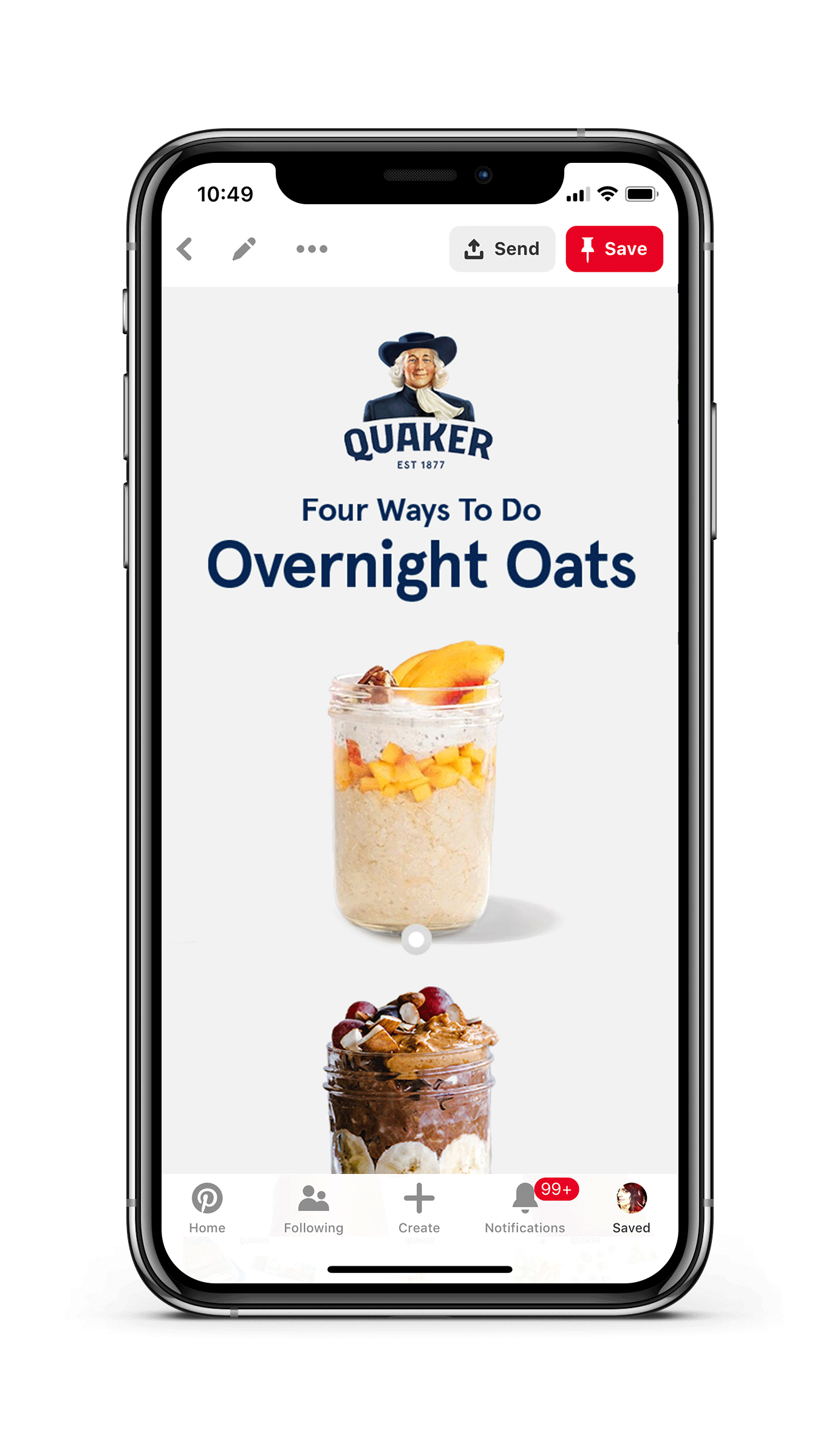
I helped lead Quaker through a social refresh, pivoting from a functional nutrition space into focus on flavor. My role included creating the social playbook for campaign content, design direction for lifestyle photography, implementation guidelines, creating stop-motion assets and developing a relatable, multi-channel social tone of voice for the brand.
TEAM | R/GA LA LA | Lars Hansson, Pete Baston, James Moore, Elena Dick, Elana Matulic
ROLE | Freelance Creative Director / Design Director